
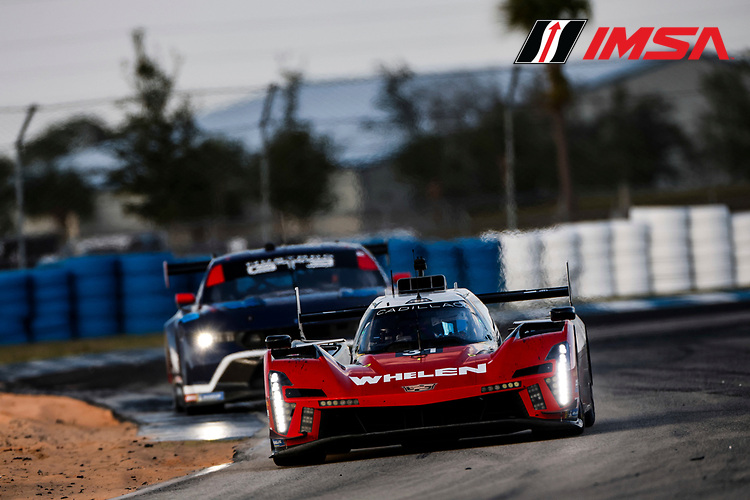
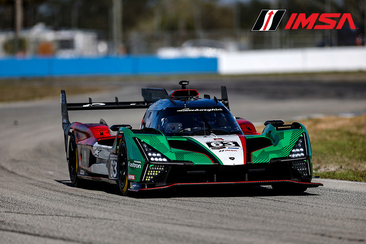
Last week, the official IMSA tests were held at Sebring, where we were able to see the new Aston Martin Valkyrie LMH on the track for the first time, totaling six different brands and the debut of a car built under LMH regulations in the North American championship.
BoP Analysis
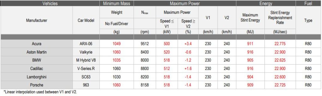
According to the BoP released for the race, the heaviest cars were the Valkyrie, Cadillac and Porsche, with 1,060 kg, contrasting with the 1,030 kg defined for the Lamborghini SC63. As for power, only the Aston Martin was allowed the regulatory maximum of 520 kW (697 HP), while the “least powerful” cars were the Acura ARX-06. Another interesting factor is that the energy allocation per stint for the Valkyrie was 916 MJ, the same as the Cadillac V-Series.R, with the same fueling rate, which may indicate a shorter range since the Aston is the only non-hybrid car and the one with the highest power from the combustion engine. My expectation for a more balanced BoP would be a greater energy allocation to compensate for the absence of the regenerative factor present in hybrid cars.
Best Lap Times
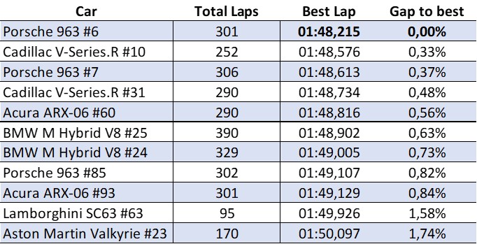
From the analysis of the best lap times, we can see a balance between Porsche and Cadillac, with Acura and BMW slightly slower. On the other hand, the times set by the Lamborghini and Aston Martin cars show that there is still work to be done by the teams. While the Aston Martin is making its debut, there is still a learning curve for the team and some margin for BoP adjustment to be implemented.
In the case of Lamborghini, the result may be related to the problem found on the first day of testing (with the #63 car only completing 95 laps, the lowest number among the GTPs), however the sequence of problems after the retirement in Daytona due to problems with the cooling system means a yellow light for the Squadra Corse team.
Box Diagram
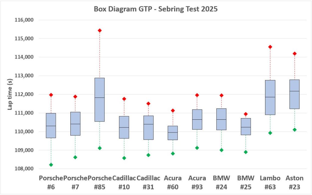
Before starting the analysis of the box plot, it is important to emphasize that the analysis considers the collection of all laps in all sessions carried out. Therefore, different training profiles such as fuel level, tire changes and other factors can generate distortions.
That said, analyzing the box plot we can see that although Porsche and Cadillac were the fastest cars, in the sample of the 60% best laps the Acura #60 and BMW #25 were more consistent, with a smaller sample range, which may indicate a better race pace. The Acura #60 stands out in particular, as the average lap time of the sample was the lowest among all the cars that trained.
JDC Miller’s #85 Porsche was one of the cars that performed below expectations, which may indicate a different training profile compared to Penske’s cars.

The Aston Martin Valkyrie completed fewer laps (170) than the other manufacturers, who completed around 300 laps for each car, and also had a 4.1 second gap in the sample, one of the largest, in addition to the worst average lap time.
About the method
To analyze the competitors’ race pace, we developed a modified box diagram, using as a reference the best laps of the best car from each manufacturer.
For this analysis, we followed the same logic used in the BoP of the WEC Hypercar category, considering the 60% of fastest laps (to account for the effect of different pit strategies and the degradation of the car during the race).
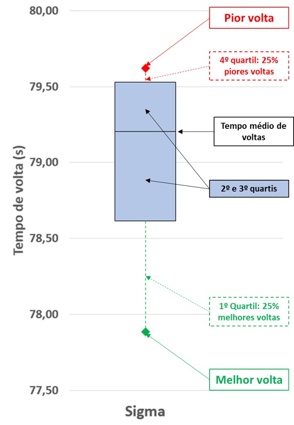
The graph data is interpreted as follows:
- Bottom green dot: represents the best lap of the race for a given car;
- Dashed green line: represents the 25% fastest laps in the sample (1st quartile);
- Central box: represents the central 50% of turns in the sample (2nd and 3rd quartiles);
- Center line: average lap time considering the sample;
- Dashed red line: represents the slowest 25% of laps in the sample (4th quartile);
- Top red dot: worst lap of the sample
In general terms, the smaller the green and red lines, the smaller the dispersion, i.e., the more constant the car was. Likewise, the smaller the central box, the more constant the performance was. One limitation of the sample size and type chosen is that the distribution does not exhibit “normal” behavior in both directions, so that the first quartile (green line, 25% best laps) will always appear elongated in relation to the fourth quartile (red line, 25% worst laps).